How do we help people stay mindful one drink at a time?
- 2020
- Framna
- Native app
- UI
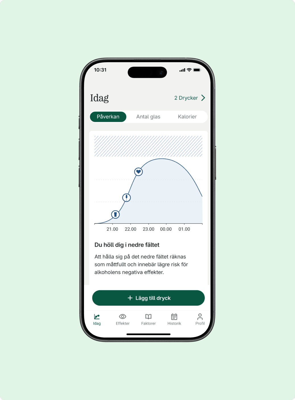
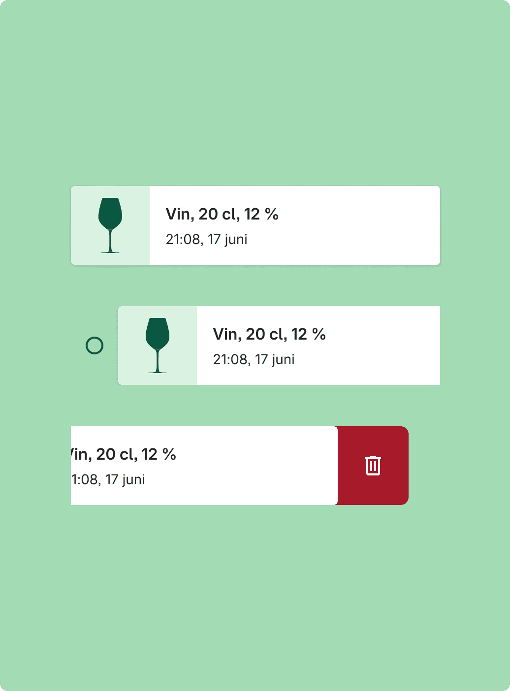

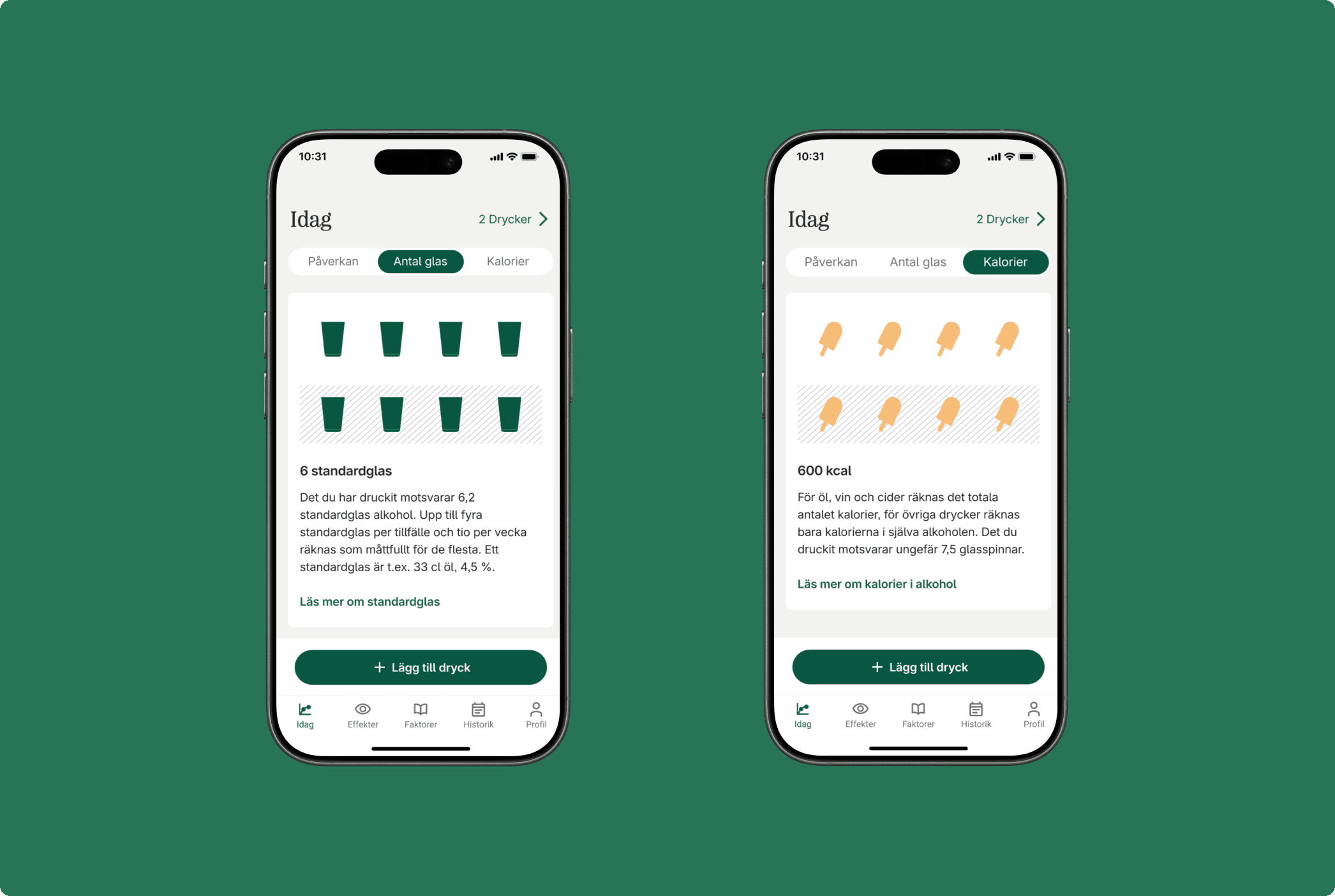


Soft color zones replace traditional warning indicators throughout the interface. We deliberately avoided harsh reds, aggressive alerts, or anything that might feel punitive. The goal was to inform through clarity and help users build understanding over time, not create alarm through visual intensity or make them feel bad about their choices.
Problem statement & objectives
Systembolaget saw an opportunity to help the Swedish population build healthier habits around alcohol consumption through a complete revamp of their existing Promillekoll app. I was asked to help the team create a new app experience that would make tracking consumption feel natural and supportive.
Design process
This was a 2-3 month project where we built a native app from scratch, using insights from the previous Promillekoll app as our starting point. Working alongside a UX designer and product lead, I helped shape an experience that would let users track their alcohol consumption and understand its effects on their body without feeling judged.
Together with Systembolaget, we conducted customer interviews to understand what features would be most relevant and how to approach education around alcohol in a way that felt supportive rather than critical. We needed to find the right balance: encouraging conscious consumption and providing clear health information while keeping the tone warm and non-judgmental.
My focus leaned more towards the UI. Since Måttfull would become one of Systembolaget's digital touchpoints, we worked within their existing design system and interaction patterns. I reused components from their customer app (buttons, cards, typography, color styles, icons, and illustrations) to create a cohesive experience that felt familiar to existing users while giving the new app its own identity.
Best current answer
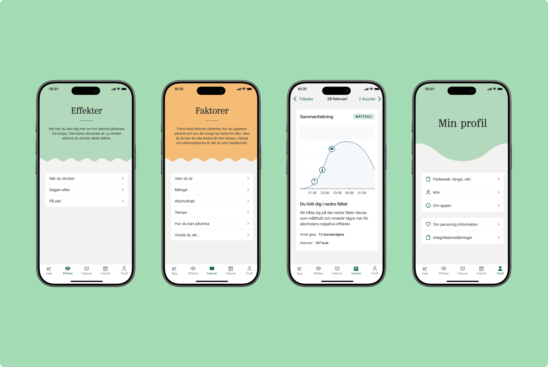
The final app was built around 4 tabs: Today, Effects, Factors, and Profile. Today let users view their daily intake in different ways: as a graph, in standard units, or in calories.
Research showed us that different people respond to different types of information.
Instead of showing raw numbers or blood alcohol percentages, the graph displays a smooth curve that shows how alcohol impact rises and falls over time. A solid line shows actual consumption, while a dotted line projects how it will decline. A vertical "now" marker shows where the user is in the present moment, making it easy to think: "If I stop now, this is what happens next." The background uses soft color zones to show lower versus higher impact ranges. We kept these subtle with no harsh reds or warning symbols to avoid making users feel ashamed.
From a UI perspective, emotional response mattered most. Every visual choice, from color intensity to how the graph curves, came down to one question: "Does this make the user feel informed, or judged?" We used Systembolaget's wider color palette to set Måttfull apart from their main app and give each tab its own feel. The visual style is calm, friendly, and helpful. Built for reflection, not control.
Impact & learnings
An alcohol-awareness app for Sweden's state alcohol retailer, built to help people reflect on their drinking and avoid overconsumption. Delivered in three months; Systembolaget renewed and expanded the engagement afterwards, with the team growing to work on improvements and new features.
- Shipped in 3 months, for iOS and Android.
- 50,000+ downloads across both platforms (client analytics).
- Still live and maintained five years after launch, with continued releases through 2025.
- Client renewed and scaled the engagement on the strength of the initial delivery.
- Sustained daily use reported by users over 18+ months, with feedback on trends, export, and health-app sync feeding directly into the roadmap.
Designing around a sensitive habit like alcohol consumption means walking a fine line between supporting users and controlling them. The debate the app sparked about what to show, and how, was the work. Listening to users and adapting to their feedback is what keeps a product on the right side of that line.
Tools & frameworks
- Figma
- Figjam
- Zeplin
- Notion
- Jira / Confluence
- Slack
- Testflight
- Native apps
Other projects