How do we flip the switch from good to great?
- 2025 to present
- Concept
- Vattenfall
- React Native
- UX
- UI
This project helped our team step back and think about where the app should go next. Through workshops and customer research, we identified what users really needed and created a realistic plan that mixed quick improvements with bigger changes. Breaking everything into smaller steps meant we could keep shipping features while gradually making the app better.
Problem statement & objectives
The focus on delivering new features meant improvement tasks often got deprioritised. I thought it could help to create a vision for where the app could go next, something that balanced user needs with business goals while exploring new possibilities to take the experience to the next level for our users.
Design process
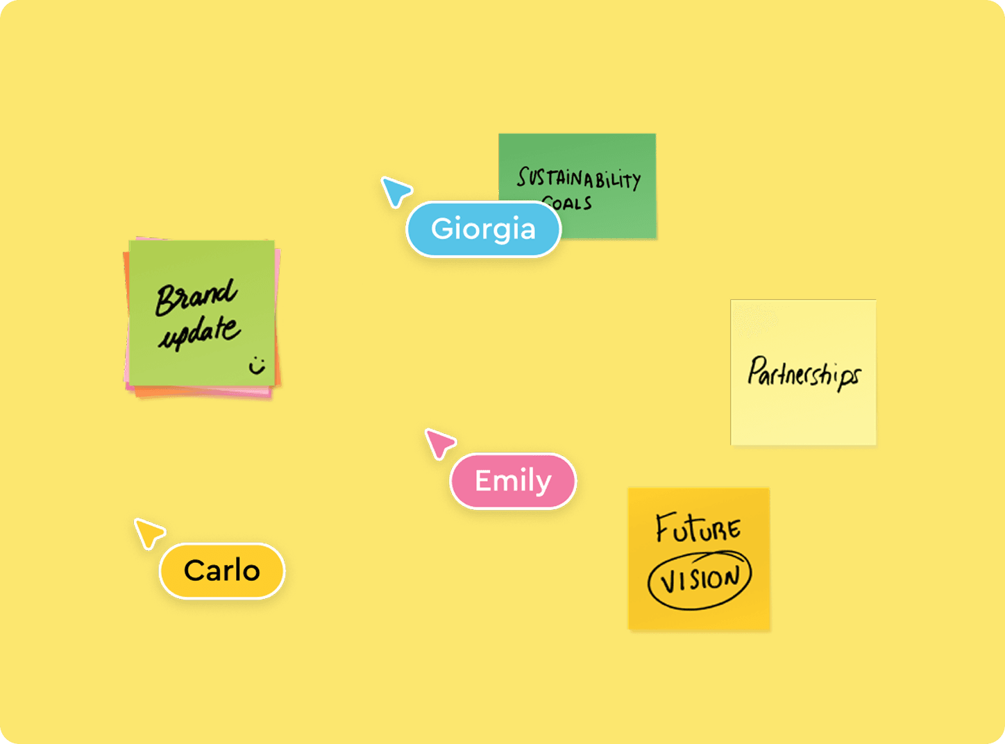
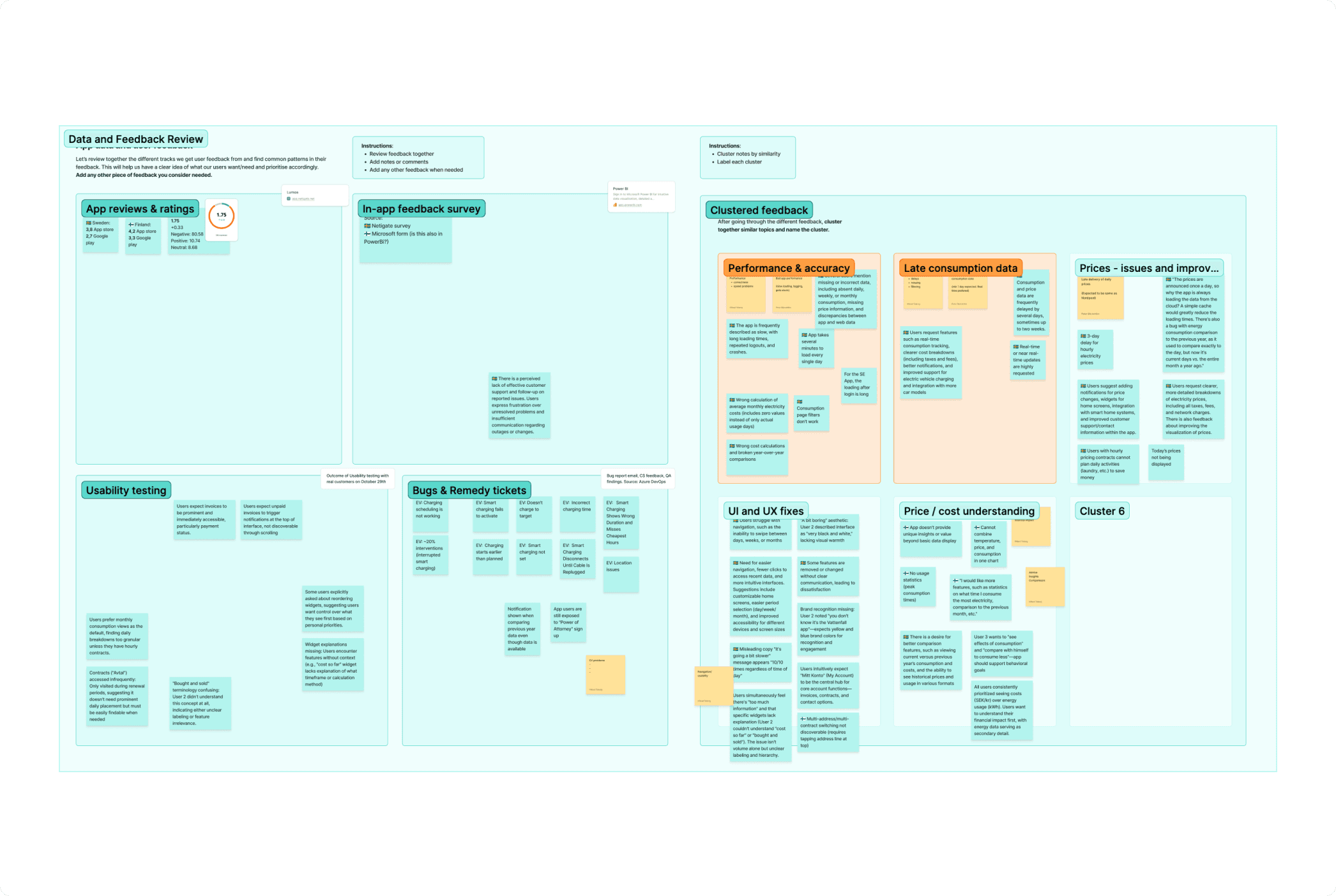
Working in-house gave me direct access to customer feedback and sales teams. I brought our product owner and design team together for ideation workshops where we identified key areas to improve: data quality, UI updates, personalisation, and better energy tracking tools.
The tech team was also building an MCP server to enable AI features like cost predictions and personalised insights. With that in mind, we started rethinking the app. We kept the brand recognisable but added more playful colors, something users and stakeholders had been asking for.
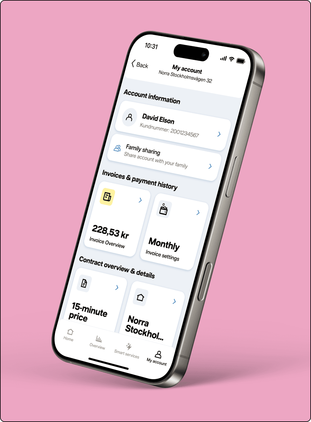
The tab structure mostly stayed the same, but we moved Documents into My Account and brought Account back to the tab bar. Usability tests with Vattenfall customers showed they expected documents and contract details under My Account. Analytics from Piwik Pro and PowerBI confirmed most people navigated through Home tab widgets anyway.
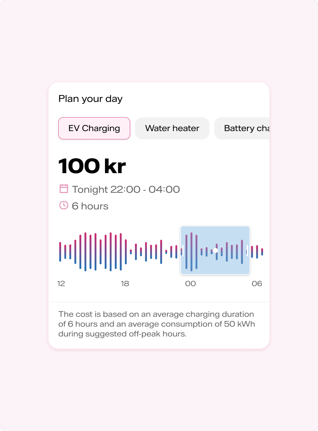
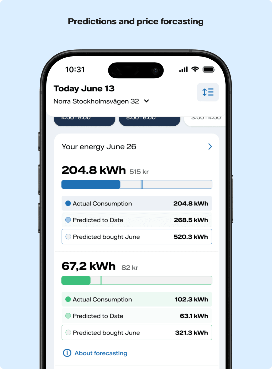
We reintroduced features like the consumption planner, which helps users schedule activities during the cheapest hours, and household consumption comparisons for realistic benchmarks. Once wireframes and prototypes were ready, we broke the work into 8 phases so improvements could roll out alongside new features without overwhelming the dev team.
Best current answer
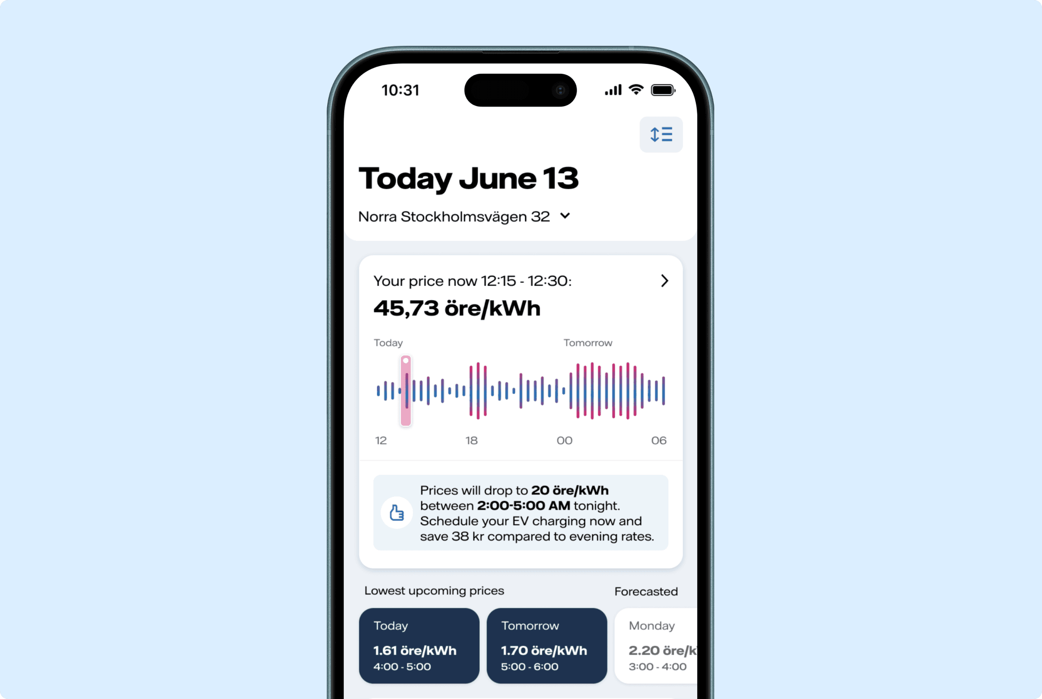
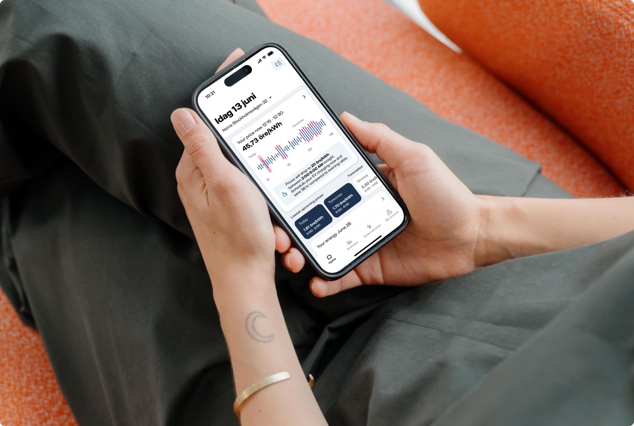
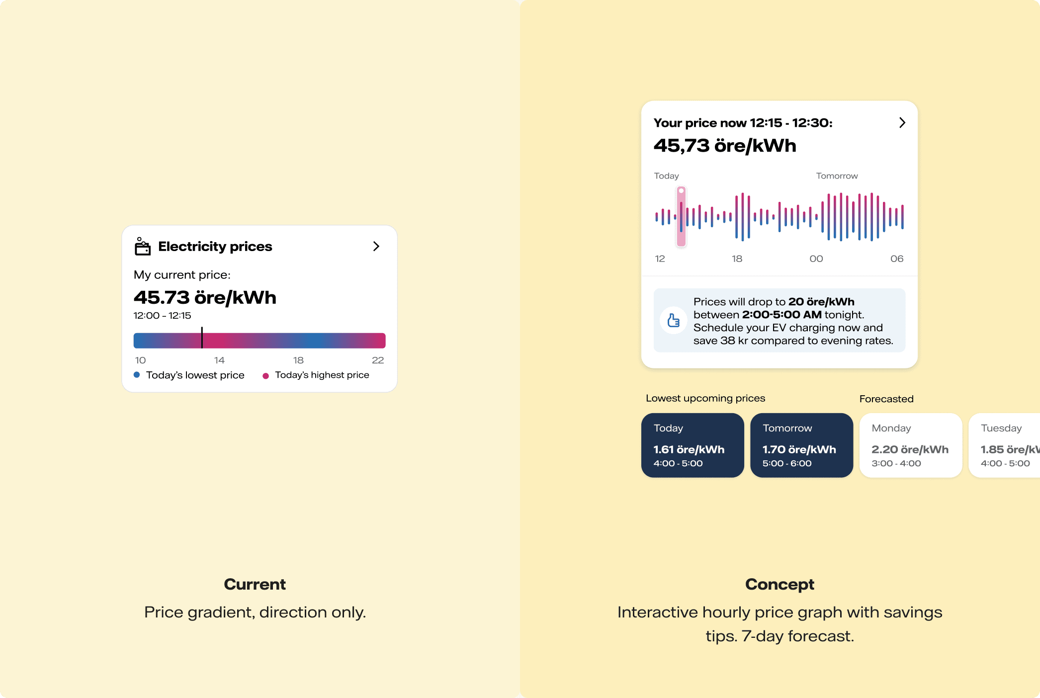
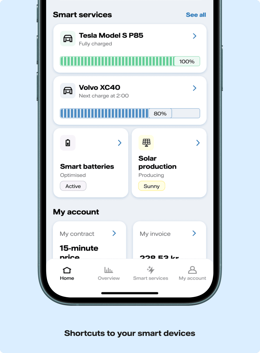
The new concept made Home tab widgets interactive. Instead of just showing static information, users could now tap through to see more details. We added 7-day price forecasting so people could plan their energy use ahead of time and save money.
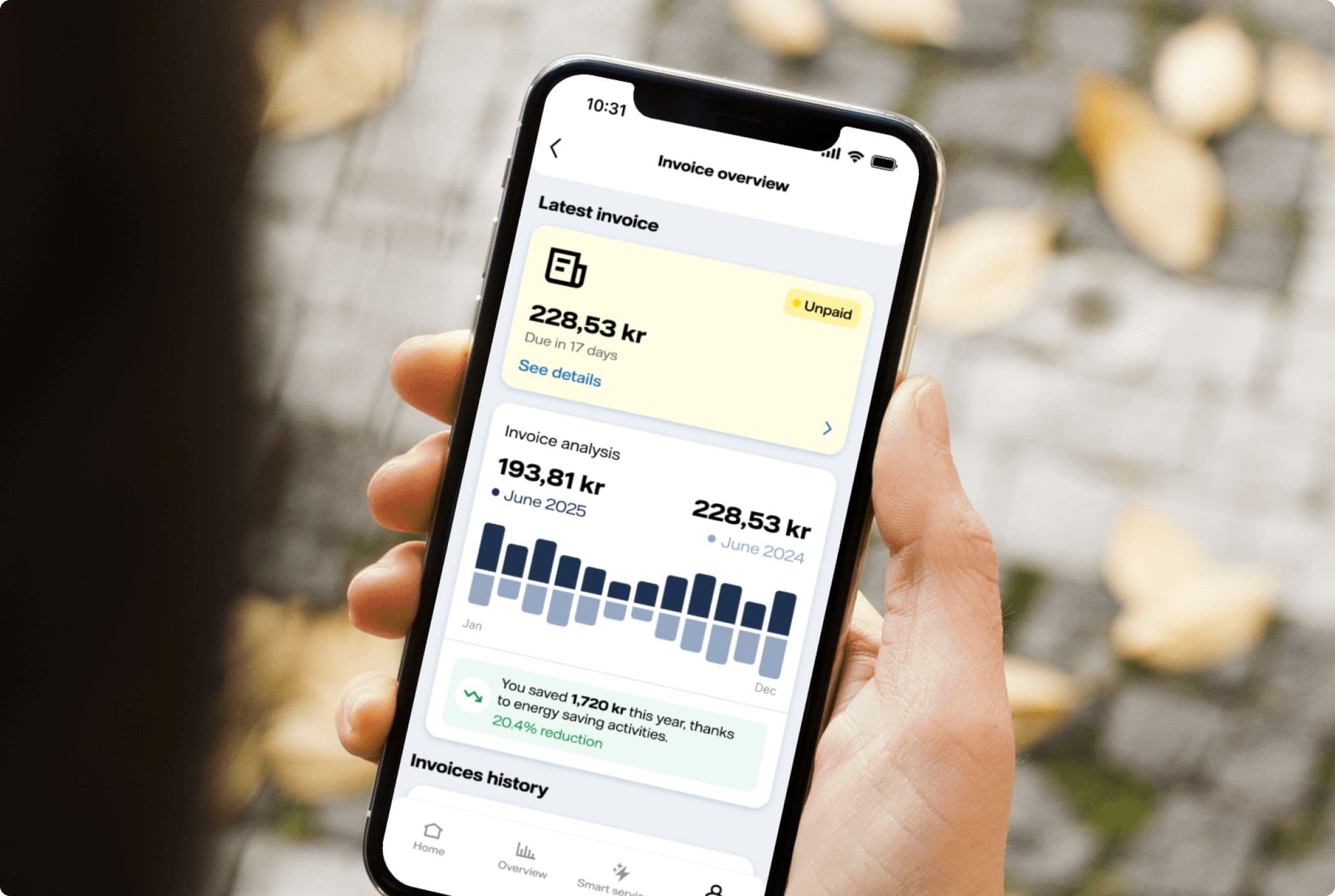
Removing the Documents tab could have caused problems, so we added contract and invoicing widgets directly on Home. This actually made it quicker for users to find what they needed.
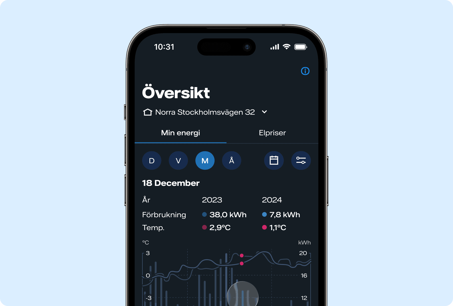
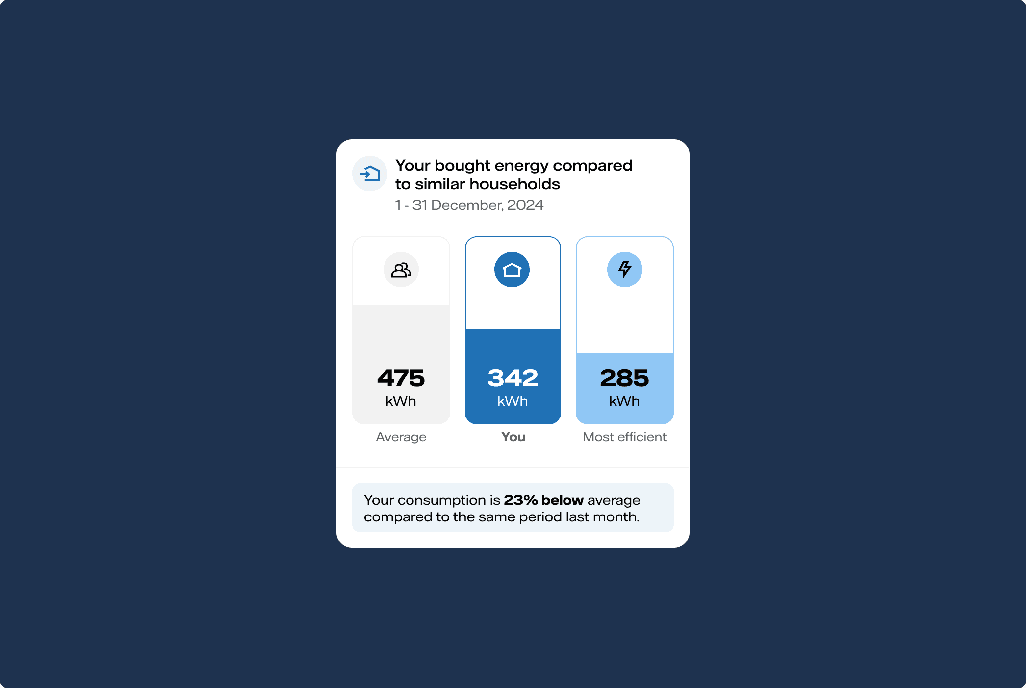
The Overview tab got new features. We added comparisons with similar households so users could see how their energy usage stacked up against others. Next to these comparisons, we included personalised tips for using energy more efficiently.
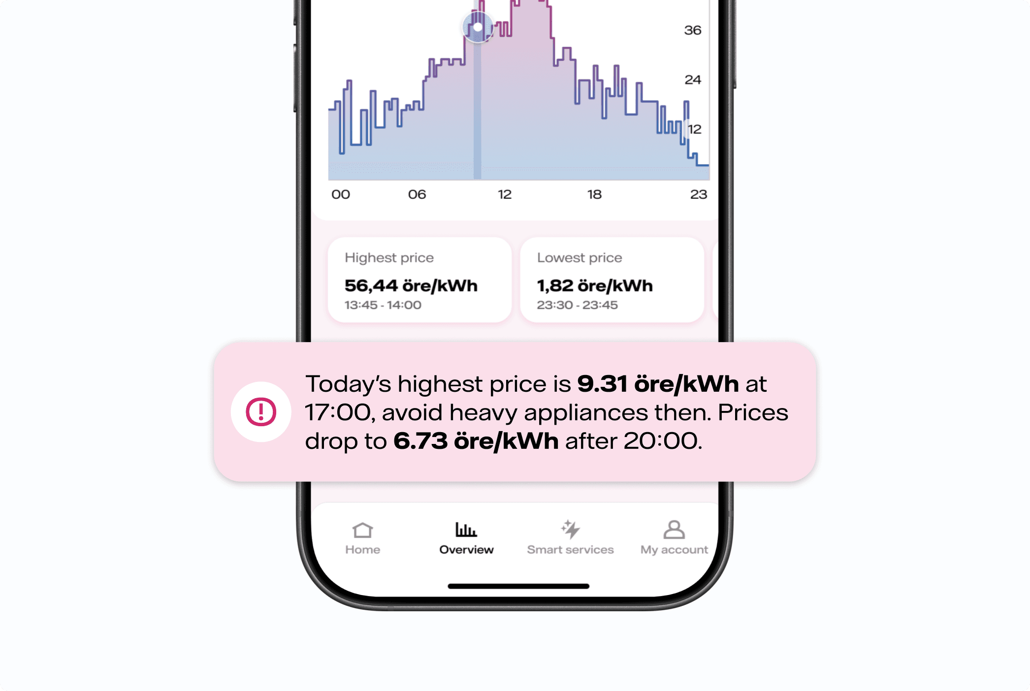
In the electricity prices view, we added a consumption planner that helps users schedule things like laundry or EV charging during cheaper hours. We also built price alerts that send daily notifications about the highest and lowest prices.
We restructured My Account to focus on what users care about most. The new layout makes it easy to access invoices, contract details, and customer support.
Impact & learnings
This project brought the team together around a shared vision and gave us a clear direction forward. Working with our product owner and business leads, we made sure the concept was realistic and could actually be built in the coming months.
The biggest lesson was the value of getting everyone involved early. This wasn't just a design goal, it became something the whole team believed in and wanted to achieve together.
Using data helped a lot with stakeholder buy-in. Diving into analytics dashboards and talking to people across different teams made the case stronger and built support for the changes we were proposing.
Tools & frameworks
- Figma
- Figjam
- Figma Make
- Power BI
- Piwik Pro
- Lokalise
- Netigate
- Optimizely
- Azure devOps
- React Native
- Copilot
- ChatGPT
- Claude
Other projects