How do we spark smarter energy habits?
- 2023 to present
- Framna & Vattenfall
- React Native
- UX
- UI
Process
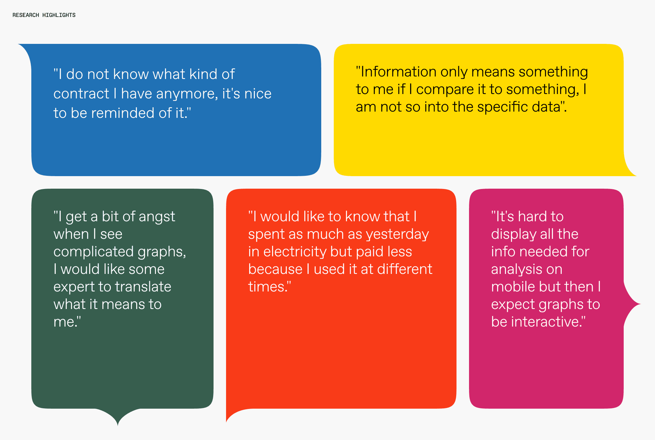
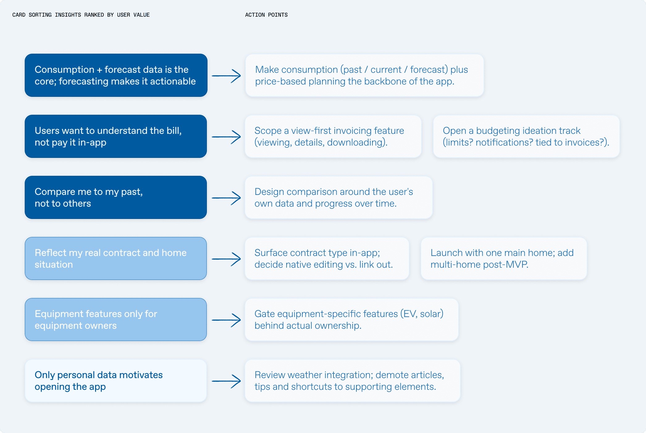
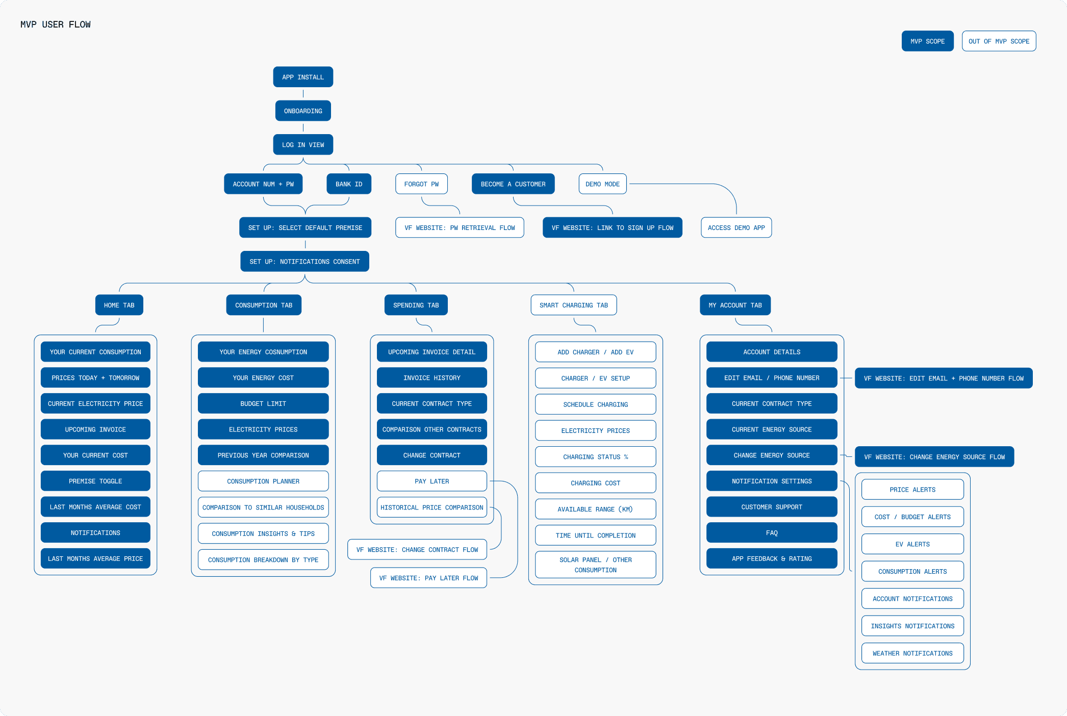
Users want the app to be a mirror of their own energy reality: their consumption, their invoice, their contract, their progress, not a content hub or a social comparison tool. Every high-value feature is self-referential data; everything generic (weather, articles, neighbour benchmarks) fell to the bottom.
Result
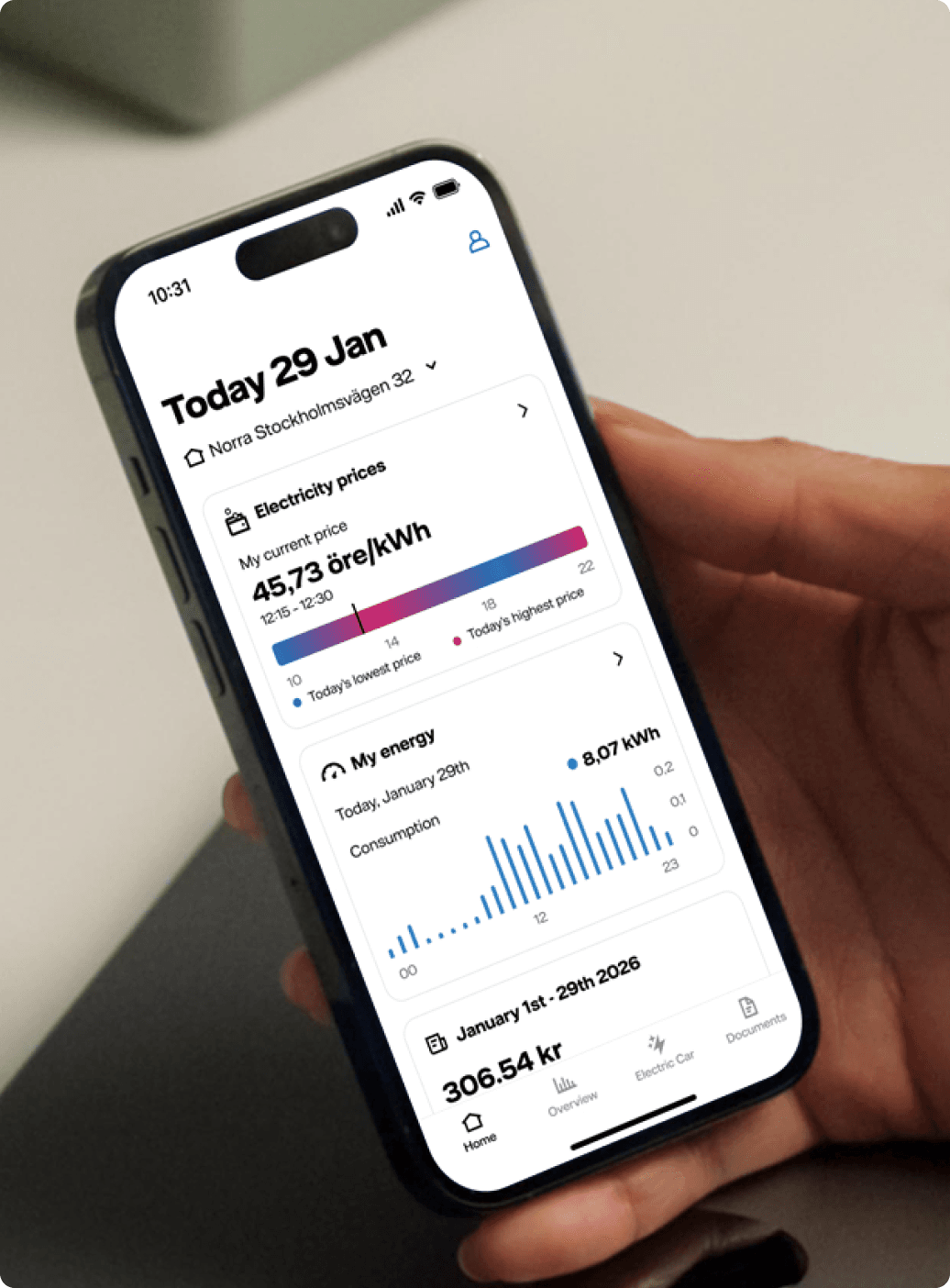
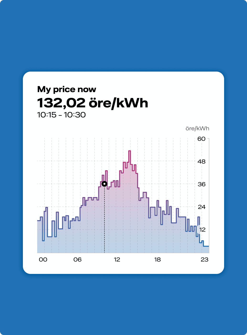
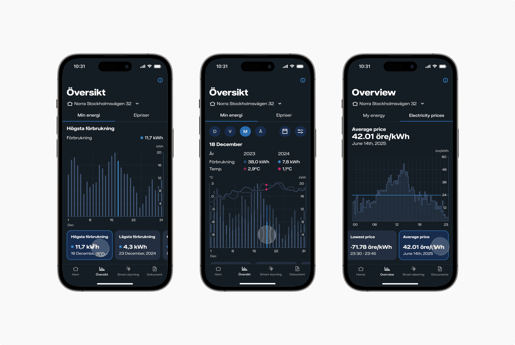
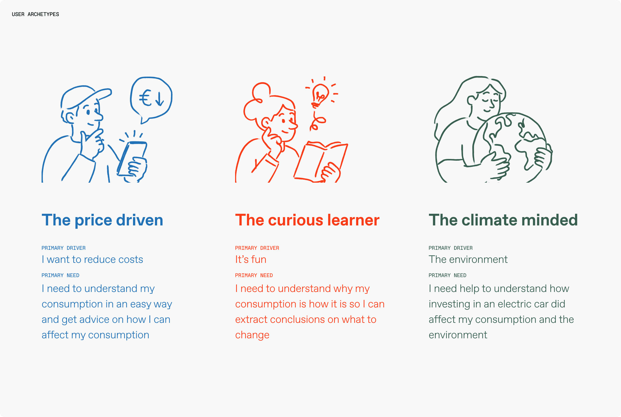
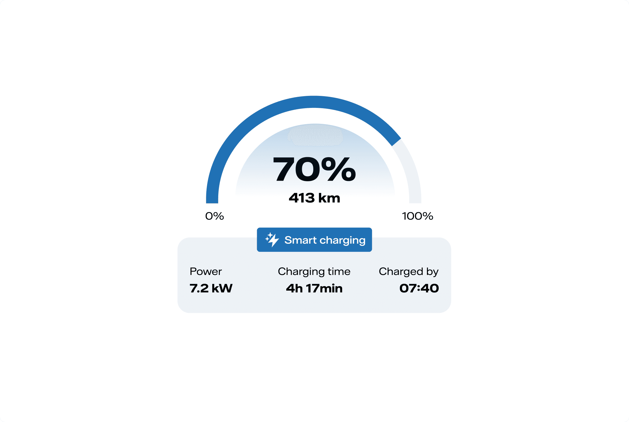
A very engaged section of our target audience is people who care a lot about the data, that want to know every little detail of their consumption and the price they are paying, regardless if it’s driven by wanting to save money or they are just curious about it. That meant we had to be accurate and transparent with the data on a user-friendly interface.
Problem statement & objectives
As electricity prices increased, Vattenfall identified a growing need among customers to track and understand their energy usage in order to make more efficient consumption choices. I joined the team to design a tool that would present consumption data in a straightforward way, helping users find opportunities to cut costs while reducing their environmental footprint.
Design process
I joined this project at Framna and moved in-house to Vattenfall in March 2025. Leading a small team of two designers and a UX writer, I drove the end-to-end design process, from product strategy, wireframes and prototypes to design system work and stakeholder alignment.
Customers were switching to competitors for better access to real-time data that allowed them to consume smarter and pay less at the end of the month. The challenge was clear, we needed to create Vattenfall's first consumption mobile app to stay competitive.
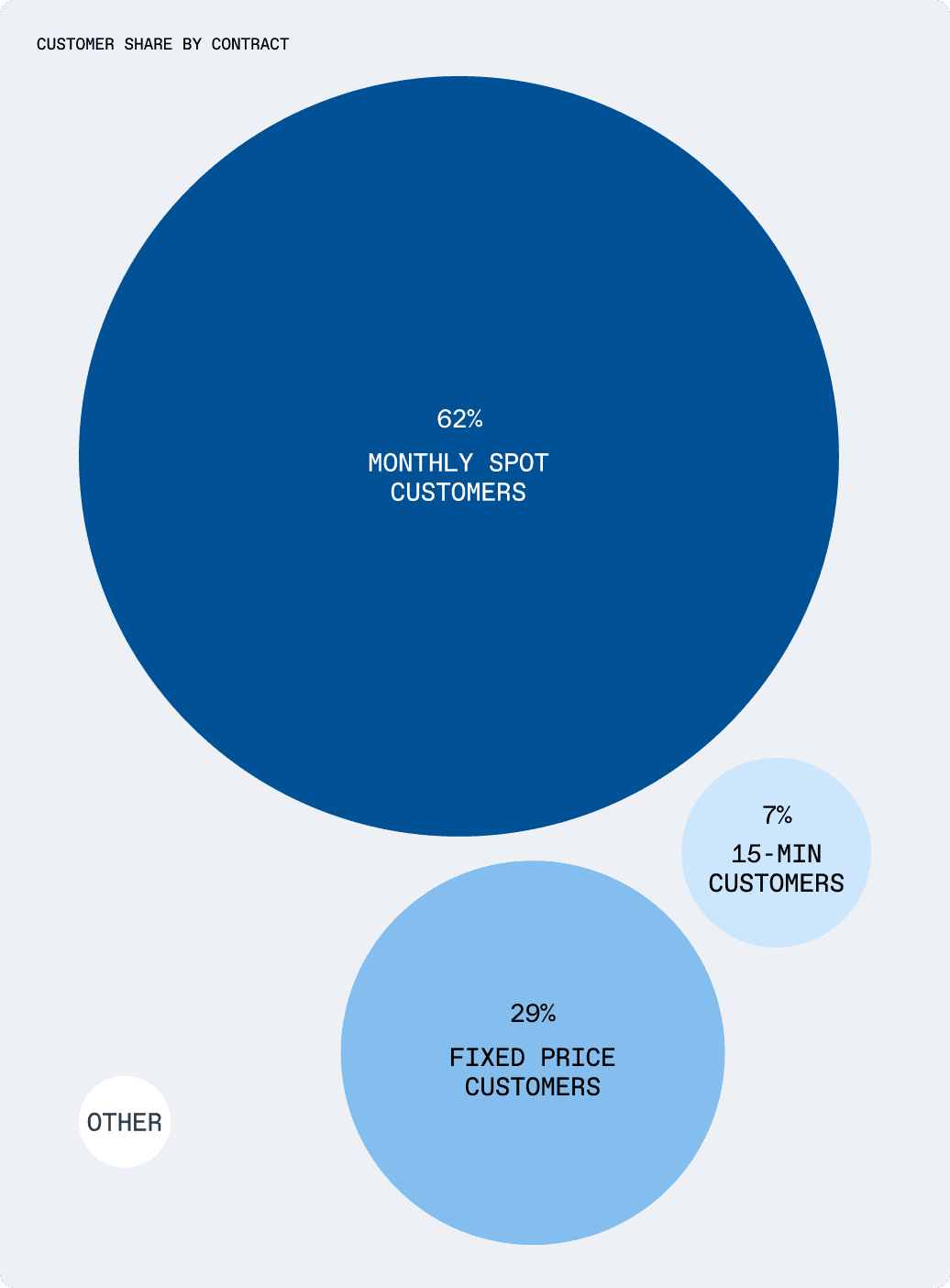
Vattenfall's initial brief was an app exclusively for customers on the 15-min contract, around 7% of users. Through discovery interviews and a competitor audit, we learned this framing was too narrow: offering a new consumer app for only a small segment of customers would feel like a missed opportunity to bring value and increase engagement and satisfaction on the whole customer base.
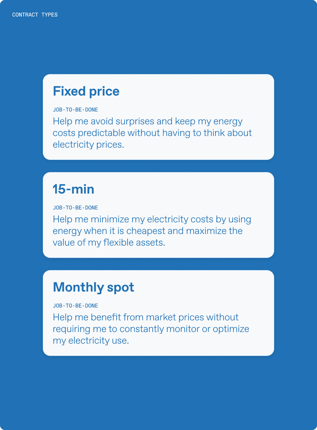
Fixed price customers wanted predictability, mainly invoice confirmations and reassurance that costs were under control. 15-min customers needed hourly prices and consumption data to shift usage to cheaper hours and get the most from their flexible assets. Monthly spot customers sat in between: benefiting from market prices without constantly monitoring their usage.
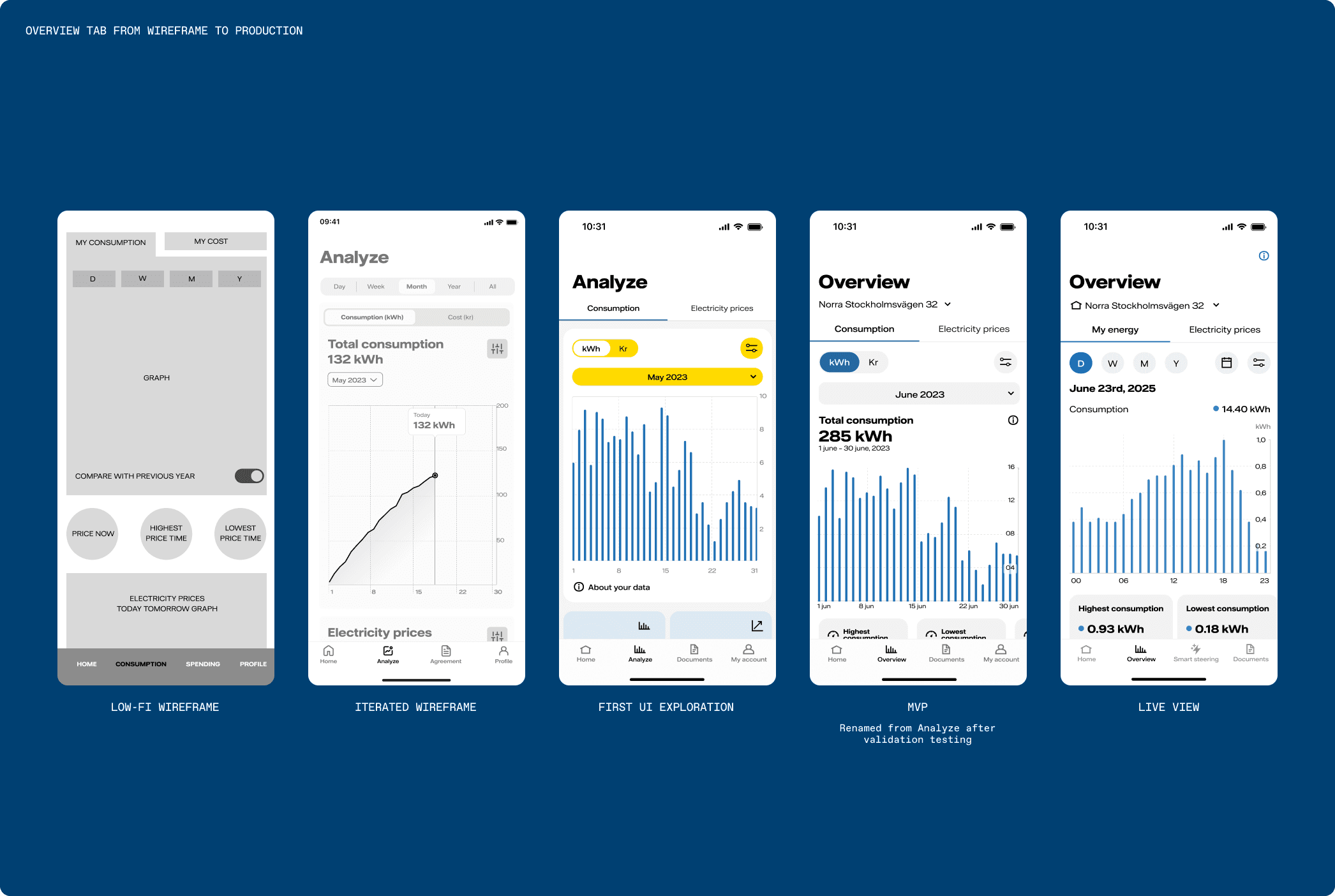
We challenged the original scope and made the case for one app serving all three types. The process then moved through card sorting to understand how customers prioritized content, iterative wireframing and prototyping, and validation testing with real users.
Two main design challenges emerged:
- An information architecture serving all customer types without fragmenting the experience or overwhelming casual users. Instead of separate flows, the Home tab adapts: layout, hierarchy and content change by contract type, surfacing what each group told us mattered most, while the overall structure stays consistent.
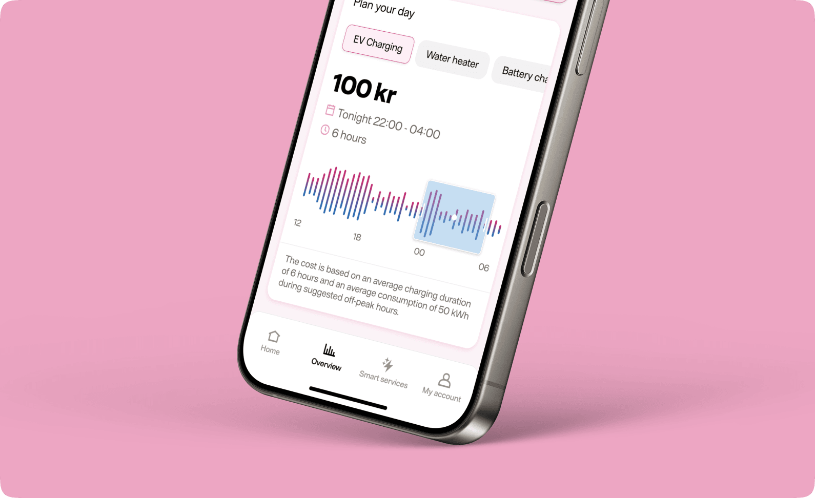
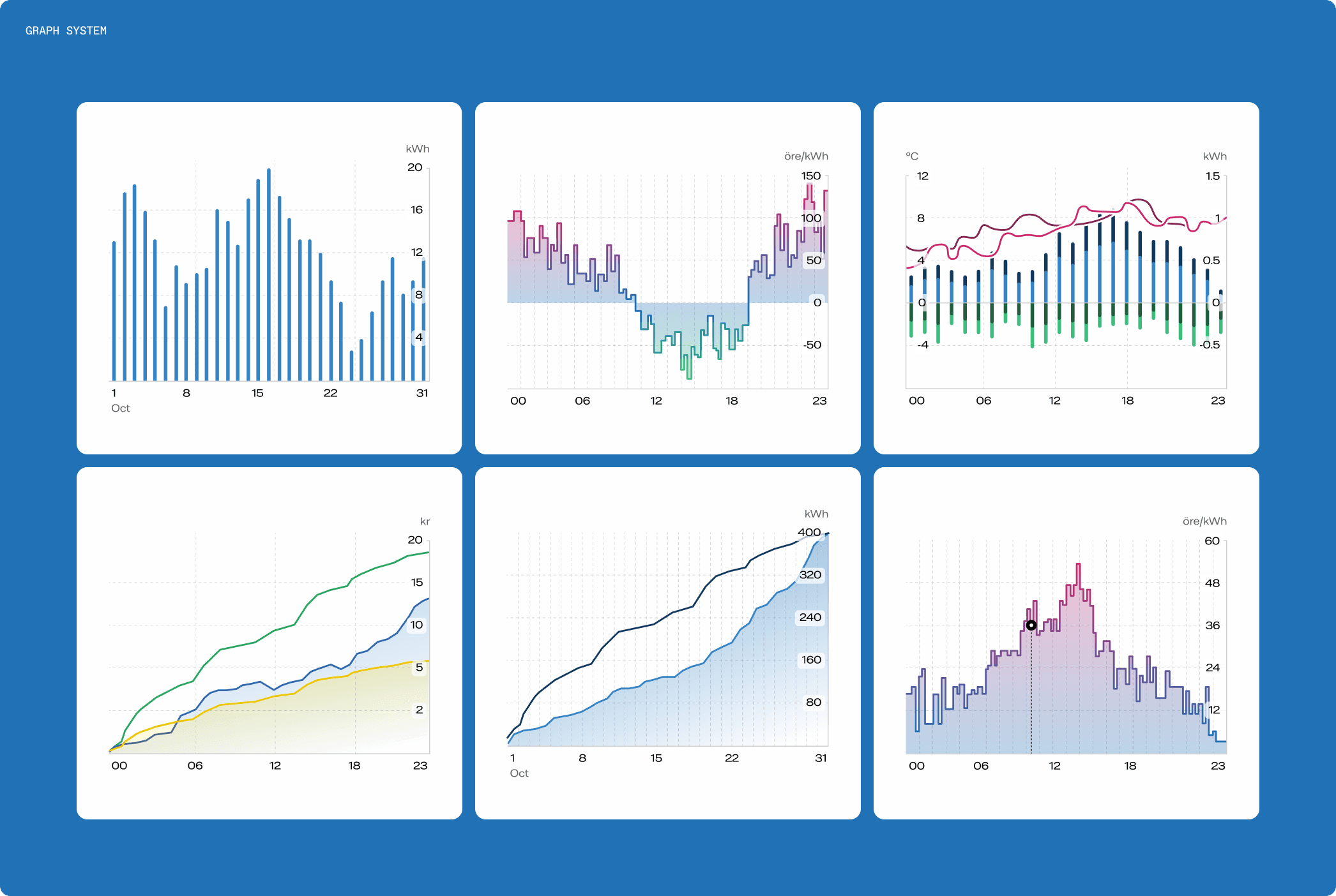
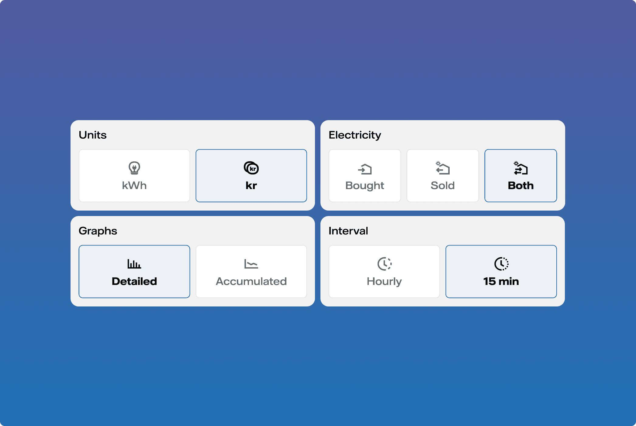
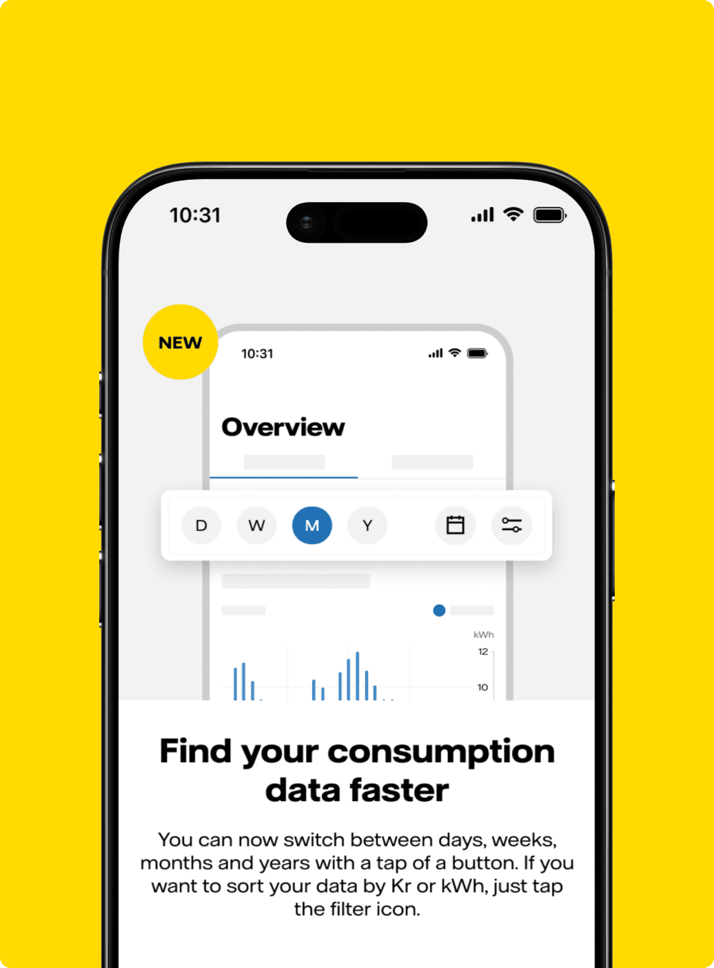
- Visualising complex data accurately and clearly, with both depth and guidance on how to interpret it. With screen space scarce, we built a graph system with different types, granularities and filters that users could toggle on and off, giving casual users a clear default while engaged customers could drill down.
Best current answer
The answer to both challenges came down to the same principle: build a structure that flexes around the user instead of forcing every user through the same experience. Here's how that played out in practice.
For the information architecture, that principle shaped the navigation itself. We landed on a 4-tab structure designed with growth in mind, giving users quick access to what they cared about most while leaving room for the product to evolve without restructuring the app every time a new feature shipped. Contract and invoicing information, which users kept telling us was essential, earned its own place directly in the navigation rather than living buried in a settings menu.
The Home tab became the clearest expression of the flexing idea: custom widgets per contract type, with hierarchy and content shifting to match each segment's needs. Fixed price customers see reassurance first; 15-min customers see prices and consumption. The longer-term vision takes this further, handing curation over to users so they can shape the content they see themselves.
The same principle carried into the data visualisation work, where our research had made one thing clear: users who care about data expect detail. That pushed us away from oversimplifying and toward providing the most detailed graphs we could, balancing depth against visual overload and usability. The resolution was to start simple, then allow customisation. A filtering system lets users choose the resolution and comparison data they care about, and because filters persist between sessions, each user effectively creates their own default view. The app adapts to them, not the other way around.
To make all of this hold together at scale, we worked closely with the developers to build reusable React Native chart components. With graphs appearing throughout the app, this ensured visual and behavioural consistency across the app experience.
Impact & learnings
We successfully launched a Beta program in September, just 5 months after the project started and followed by a full app release in November.
The Mitt Vattenfall app has seen significant user adoption and positive reception:
- As of November 2025, we've surpassed 170,000 downloads in Sweden, with over 5,000 new users joining monthly.
- The app maintains a strong 3.8 rating on App Store, indicating high user satisfaction.
- After launching, overall churn at Vattenfall declined from ~13% in 2023 to ~6% in 2026.
- Customers using the Mitt Vattenfall app have shown higher customer advocacy, reaching an NPS of +12 and outperforming non-app customers by up to 19 points.
- We've implemented continuous feedback channels, allowing us to gather user insights and consistently improve the app.
- Released the Mitt Vattenfall app in Finland, just a few months later.
Working with hybrid teams (product agency + client side stakeholders and team members) taught me that transparent processes and clear requirements are essential under tight deadlines. I learned to design flexibly to accommodate scope changes, start simple with complex data visualisation, and treat the initial release as a foundation for iteration based on continuous user feedback.
Tools & frameworks
- Figma
- Figjam
- Rive
- Lokalise
- Netigate
- Figma Make
- Copilot
- ChatGPT
- Claude
- Azure devOps
- React Native
Other projects